Categories
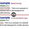
The latest development for improving the mobile search results and the mobile user experience further is The Accelerated Mobile Pages (AMP) Project, which is an open source initiative that embodies the vision that publishers can create mobile-optimized content once and have it load instantly everywhere. AMP is a way to build web pages for static content that render fast.
The difference between a mobile-friendly page and AMP can be understood by the following questions.
What are Mobile-Friendly Pages?
Mobile-friendly pages are pages with Responsive Web Design (RWD). RWD is a web design approach aimed at crafting sites to provide an optimal viewing experience across a wide range of devices -from desktop computer monitors, tablets to mobile phones. In particular, reacting to the width of the browser window — not just flowing the text, but often changing aspects of page layout.
What are Accelerated Mobile Pages (AMP)?
AMP or Accelerated Mobile Pages is an open source initiative by Google launched in October 2015. Accelerated Mobile Pages (AMP) are lightweight pages designed to load quickly on mobile devices. AMP-compliant pages use a subset of HTML with a few extensions. Accelerated Mobile Pages (AMP), is a very accessible framework for creating fast-loading mobile web pages.
How Can a Website Become Mobile-Friendly?
A website can be made responsive or mobile-friendly by adding Media Queries.
Media queries let the display of content be according to the user device without having to change the content itself. It is a CSS technique introduced in CSS3. Media queries allow the web page to use different CSS style rules based on the features such as width, height, and color. A media query is a logical expression that is either true or false.
For Example:
<!– CSS media query on a link element –>
<link rel=”stylesheet” media=”(max-width: 800px)” href=”sample.css” />
<!– CSS media query within a stylesheet –>
<style>
@media (max-width: 600px) {
.facet_sidebar {
display: none;
}
}
</style>
When a media query is true, the relevant style sheet or style rules are applied, following the normal cascading rules.
How Can a Website Become AMP Compliant?
A website is made AMP compliant as per instructions on https://www.ampproject.org/docs/get_started/create.html but the AMP pages also have to be made responsive or mobile-friendly.
Are There Any Duplicate Content Issues With Responsive Websites?
There are no issues related to duplicate content regarding responsive pages.
Are There Any Duplicate Content Issues for an AMP Compliant Website?
A responsive page or a mobile-friendly page is the same page of the website which is served in a different layout. The pages get displayed according to the device from which they are accessed. AMP pages are served to the user from the Google AMP cache. AMP pages have a different URL. Hence, the duplicate content issue has to be sorted out. The Google AMP Cache is a proxy-based content delivery network for delivering all valid AMP documents. It fetches AMP HTML pages, caches them, and improves page performance automatically.
We will convert your old WordPress website into clean Google AMP (Accelerated Mobile Pages).
Whatsapp: 08086697100
Email: [email protected]
If your website is AMP compliant and If you have both AMP and non-AMP versions of your pages, include the following links:
On any non-AMP page, reference the AMP version of the page to let Google and other platforms know about it:
You can validate AMP on https://validator.ampproject.org/
You can test how mobile-friendly the page is on https://testmysite.thinkwithgoogle.com/intl/en-in
Yes. Since April 21st, 2015, Google started expanding its use of mobile-friendliness as a ranking signal. Mobile-friendliness will continue to remain a ranking factor as AMP also have to be made responsive.
No, AMP is still not a ranking signal as mentioned by John Mueller, a Google Webmaster Trends Analysts, in a Google Hangout, at the 15:50 mark into the video.
On November 18th, 2014 Google added a “Mobile-friendly” label to mobile search results. But recently Google announced:
To keep search results uncluttered, we’ll be removing the label, although the mobile-friendly criteria will continue to be a ranking signal.
Google had introduced AMP as top stories in the carousel for mobile SERPs. In August 2016 Google started sharing an early preview of expanded AMP support across the entire search results page on g.co/ampdemo and not just the “Top Stories” section. AMP pages are labeled with the icon in search results.
Originally posted on February 16, 2018 @ 9:11 am